Question 28
(Not Answered)
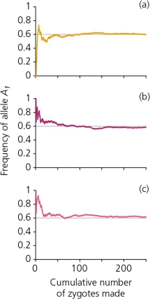
A scenario in which 250 zygotes are formed from a gene pool in which the frequency of the allele A₁ is 0.6,and A₂ is 0.4,generates the accompanying figure.Explain,in general terms,what each of these graphs reveals.Is there a consistent pattern between all three graphs? If so,describe and provide an explanation for it.Are there inconsistencies among graphs? Describe and provide an explanation for these also.
This question doesn't have an answer yet