Question 46
(Essay)
Refer to the figure.
Figure 1
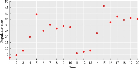 Use the data from the figure to draw a line graph (this will be referred to as Figure 2) that illustrates how population size changes over time. From time 1 to time 10, what type of logistic curve best fits this data? In your answer, address both the pattern of the line and the underlying cause of these patterns.
Answer
Figure 2
 The figure shows a logistic c...
View full Answer