Question 13
(Multiple Choice)
Choose the correct interpretation of the charts below. (Note: The x-axes represent the benefit; the y-axes represent the utility.)
Chart A Chart B
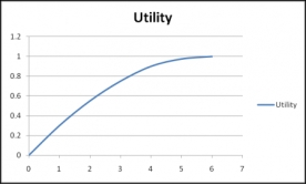
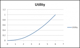
A) Chart A represents risk-aversion and chart B represents risk-neutral.
B) Chart A represents risk-prone and chart B represents risk-aversion.
C) Chart A represents risk-prone and chart B represents risk-sensitive.
D) Chart A represent risk- aversion and chart B represents risk-prone.
E) Both chart A and chart B show risk-aversion.
Answer