Question 72
(Multiple Choice)
Refer to Figure 53.4 and then answer the following questions.
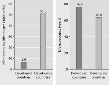
Figure 53.4: Infant mortality and life expectancy at birth in developed and developing countries (data as of 2005).
-What is a logical conclusion that can be drawn from the graphs above?
A) Developed countries have lower infant mortality rates and lower life expectancy than developing countries.
B) Developed countries have higher infant mortality rates and lower life expectancy than developing countries.
C) Developed countries have lower infant mortality rates and higher life expectancy than developing countries.
D) Developed countries have higher infant mortality rates and higher life expectancy than developing countries.
E) Developed countries have a life expectancy that is about 42 years more than life expectancy in developing countries.
Answer